 Rival
Built to connect.
An athletic identity rooted in the interlocking RL mark. Direct, confident and welcoming to every person behind the game.
The mark
The navy R and teal L share a forward-moving shape. Preserve the proportions and keep at least one quarter of the mark’s width clear around it. Use the symbol at 24 pixels or larger; use the wordmark when the name needs to be introduced.
 Rival
Download symbol SVG · Horizontal lockup · Stacked badge · Single-color SVG
The colors
#003366
#009688
#007F80
Use navy for primary text and controls. Brand teal belongs in the mark and larger accents; the darker teal supports readable text on light backgrounds. Pair with warm neutral #F7F8F4 and generous whitespace.
Product symbols
One visual family, six distinct roles. League uses a connected organization shield; Play a diamond and play symbol; Connect a conversation signal; Sites a publishing window; Match converging rivals; Tournament a championship cup. Angular geometry and a consistent stroke connect them to the RL mark.

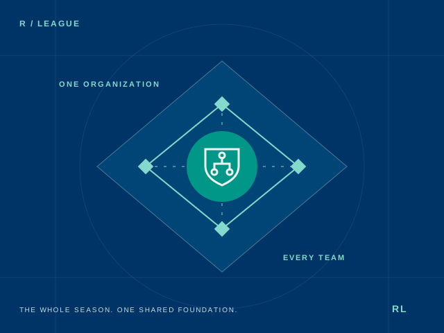

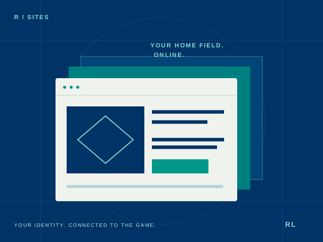

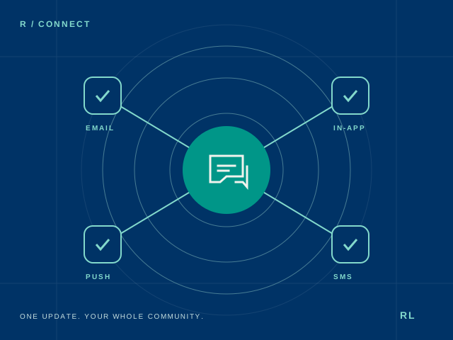

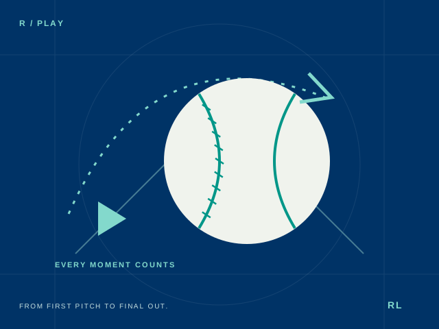

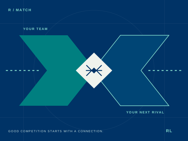

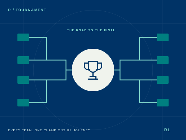
Product symbols support the RivalLink master brand. Always pair them with product names when introducing a product. Use large editorial illustrations for storytelling and the simplified symbols at small sizes; illustrations express product purpose and are not app screenshots.
The tagline
RivalLink: Where rivals meet their match. Use “Where rivals meet their match.” as the brand tagline. Product headlines explain individual benefits, including “Less busywork. More ball.” for League-focused messaging.
Type and voice
Use a bold system sans-serif for headings and a readable regular weight for body copy. Write RivalLink as one word, with a capital R and L. Product names follow the name: RivalLink League, Play, Connect, Sites, Match and Tournament.
Speak plainly about the season and the people making it happen. Explain what is available, what is being built and what comes later. Avoid exaggerated claims, invented endorsements and promises of effortless perfection.
Using the logo
Use the horizontal lockup in navigation, the stacked badge where space is square, and the symbol for small brand moments. Do not stretch, rotate, add effects, or place the mark on a competing background. Pair the related product symbols with their names while retaining the RL mark as the master identity.